Monday, 5 March 2012
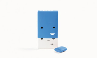
Bright, fun, minimal: Clever bubblegum packaging.
www.gubblebum.com
I'm a fan of clean, minimalistic design, and I love that Gubble Bum has managed to incorporate a minimalistic aesthetic into their packaging. Even better, they have managed to nix the seriousness often associated with minimalistic design, and they have created gum packaging with a wickedly clever sense of humour.
Each box features a different face, and when the cover is removed a skeleton is revealed. Each flavor is distinctly different, yet clearly belongs to the set. This is a great example of a product that can reach a target market—kids—without resorting to licensed characters or gaudy images. Just clean, simple, clever design.
Subscribe to:
Post Comments (Atom)


No comments:
Post a Comment