

Showing posts with label packaging. Show all posts
Showing posts with label packaging. Show all posts
Saturday, 14 April 2012
Kraken Rum Bottle Label
Wednesday, 28 March 2012
The Curious Mixture


This could possibly be one of my absolute favorite packaging designs. The use of Lost Type Co-ops' Tomasso, and clever marketing creates an absinthe bottle worth purchasing and never consuming. Not only does Stig Bratvold have a fabulously minimalist approach, but a touch of whimsy almost makes the entire design light-hearted. The dark bottle could have been heavy and drab, but excellent choice of display type in a beautiful contrasting silver gives the feeling of a bottle straight out of an apothecary, and the burlap sack gives an additional texture that compliments the design instead of fighting for attention.
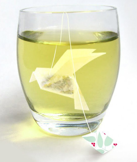
Monday, 26 March 2012
Gorgeous Tea Packaging

Monday, 5 March 2012
HELP


Sunday, 4 March 2012
A Rather Novel Collection: Eau De Parfum


While browsing the Anthropology website, I came across this beautiful set of perfume bottles and their pretty little boxes. This “scent-o-logue” features 6 editions of scents inspired by different flavors of tea around the world. Housed in book-like boxes, the titles of each are based on the tea’s place of origin. Each package is beautiful on it’s own, but I love how they look lined up as a set.
Sunday, 26 February 2012
Lovell's Lager


Lovells Lager was created by two successful Australian music industry professionals, with a passion for great tasting beer. Lovell’s Lager is an Australian beer brand that features some different and unique packaging. Most beer companies don’t really think about creative and clever packaging for their beer but this unique box with a black boombox graphic and hint of retro on a plain white box sure stands out of the crowd!
Tuesday, 21 February 2012
Jonathan Faust


Boy genius Jonathan Faust is a young graphic designer, who during his school years, worked on the Earl/Grey identity. A fictitious company, Faust put a great deal of love and attention into a minimalist approach. All from the hope of bringing popularity back to the Earl Grey tea variety, he came out with a beautiful portfolio piece, and admittedly, a print design worth putting into real production.
Monday, 13 February 2012
EarBudeez Packaging


Subscribe to:
Posts (Atom)